Look better with SCIENCE
That stuff they taught you in high school textiles was actually relevant. Who knew?
The only thing I remember from textiles class in high school is making pin cushions and having one of my mates trying to slip one that was COVERED in pins under my behind as I was about to sit down. Perhaps the constant threat of porcupine-butt is the reason that I didn’t pick up any discernible knowledge from that class. Or perhaps it was because I didn’t think it would be relevant later on in life.
Well it turns out, there was one tool that was on the curriculum which would’ve helped me out immensely in my later years. Something that could have saved me years of mismatched outfits and would’ve given me the confidence to play with colour like a boss.
Introducing, the colour wheel.
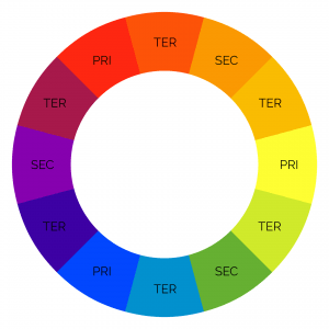
Errrrrrrr... What?
So if you’re looking at this and wondering how on Earth this relates to your wardrobe, I don’t blame you. But stick with me.
The colour wheel was first coined by Sir Isaac Newton. Yes, that Sir Isaac Newton. Ol’ mate SCIENCE!
Without making it more difficult than it needs to be, the colour wheel represents the relationship between colours and how they work with, or against each other.
So what are we looking at?
The Legend.
Now I want to be very clear about this – we’re not talking about the exact colour on the wheel. The end colour that you have on your back will be influenced by how saturated it may be as well as how “bright” or “dark” it is. The trick is to loosely match the colours in the wheel to what’s in your wardrobe.
Primary Colours (PRI – Red, blue and yellow)
Primary colours are the core colours in the wheel. Through these three colours, you can make up any other colour that is in the wheel. This inherently makes them the “root” of all colours.
Secondary Colours (SEC – Orange, purple, green)
If the primary colours were in some sort of weird, cult like trio, the the secondary colours would be the consequent children. Mix any two primary colours together and the resulting colour will be a secondary colour.
Tertiary Colours (TER – All the other colours)
The remaining colours are essentially made up of a combination of a primary colour and a secondary colour.
GET 👏 TO 👏 THE 👏 POINT 👏
OKAY OKAY!
So now you understand what the colour wheel is and how it works with itself, let’s apply this new knowledge to to your wardrobe with three, sure fire colour schemes which will prove a good basis for any outfit.
Monochromatic schemes


By far the easiest colour scheme to reproduce and one that’s very difficult to stuff up.
Simply, take a a darker colour and match it with a lighter version of the same colour, or even just plain white. As an example, match a navy suit with a light blue/white shirt.
For a cohesive suit strategy that will never fail you, bring a monochromatic scheme together by matching the colour of your jacket with the colour of your tie. This strategy creates a sense of cohesion in your look.
PROS
- Pretty hard to mess up
- Professional, clean and formal
CONS
- Not very inventive. If you’re wanting to stand out, this is not the scheme for you.
- Consider the colour that you’re working in and the the season that you’re in. Matching in the yellow range is best left for summer seasons. This is because it’s not possible to offset these colours in your look whilst still maintaining the overall colour scheme. This causes some restrictions.
USAGE TIPS
- A darker suit, lighter shirt and a darker tie combination all in the same colour is a combination that you can’t go wrong with.
- Whilst this is a scheme that is more professional in nature, try not to go too warm with your colour choice. Blues, greens and darker reds will work better in an office setting than brighter yellows and oranges.
- Remember, colour and pattern are two different things. Don’t be afraid to play around with patterns in minor accessories such as your square in order to maintain the clean look whilst adding sense of playfulness.
Analogous schemes


Analogous colour schemes are straight forward enough to figure out and provide a really consistent look to your outfit.
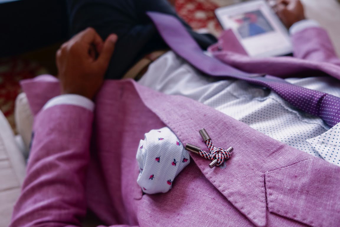
Simply decide on a primary colour and look to the colours on either side of it to influence your decisions on accessories and other items. The gentleman in the example does a great job of matching the violet in his suit with red-violet highlights of his tie and cooler blue violet of his shirt. It’s a great look and works well as a multi-purpose outfit.
You may also find an analogous scheme easier to achieve in the real world than monochromatic looks as you don’t have to match your outfit colours so closely, meaning that variations in shade work to your advantage.
These looks are fantastic in the office and are easy to achieve depending on the items that your are wanting to match. This is a great choice if you are just starting to sink your teeth into these concepts.
PROS
- Provides a clean, cohesive look
- Works great in an office setting
- Easy to match major components such as your shirt, but will also work beautifully with accessories such as cuffs and squares.
Cons
- Paints an outfit in a single colour range which can be a bit “samey” although not to the same degree as a monochromatic look.
Usage Tips
- Don’t be afraid to make your primary colour something a little bit “out there”. An olive green suit with matching blue-green highlights is an office show stopper which will still look incredibly professional with a little bit of consideration.
- When purchasing new shirts and accessories, consider what you already have in your wardrobe and make colour choices with that in mind. If you’re starting out, working towards a wardrobe that allows for analogous colour schemes is a great way to step out to more complex concepts in this field and also helps to build into other concepts such as capsules (we’ll discuss this in a later column)
Triadic schemes


This is where it starts to get interesting. Triadic schemes can be daunting but with a little bit of forethought, you can play with your colour palette to outstanding result. Triadic schemes are a personal favourite of mine due to the “balanced” nature of the scheme.
To achieve a triadic look, simply choose a colour that you wish to be the main colour of your outfit and then move two steps in both directions to identify your highlight colours. Use the other identified colours in your accessories.
The purpose of the triadic colour scheme is to create a sense of “balance” in your outfit. By representing equally separated areas of the colour wheel, you create a visually pleasing aesthetic. It does pay to be careful with this one however as you will find that if you match inconsistently to the theme, you may break this harmony.
A pro tip can be taken from the example here. You’ll notice that the green and blue components have been masterfully taken care of by the suit and shirt, however, the orange comes out in his skin tones and accessories. Your complexion can a a great ace up the sleeve when trying to match your outfit.
PROS
- When appropriately executed, can create a brilliant harmony to your outfit.
- Vibrant and unique technique that calls for compliments.
Cons
- If you work in a very formal office, this might be a schema that may not be considered appropriate, particularly if you aim for warmer colours.
- Required a reasonable eye to ensure that you’ve picked the right colour tones.
- You may find that this scheme will require a diversity in your wardrobe that you may not quite have if you’re just starting to build your wardrobe.
Usage Tips
- When I head to the races or any daytime formal event, I tend to use this colour scheme as the framework for my outfit. It’s surprising how a properly executed triadic colour scheme will seem pleasing to the eye even if they can’t put a finger on why that is the case.
- Triadic schemes are the most difficult of the schemes that we are discussing today and do require a little bit more in regards to resources. Don’t fret if you’re not at a stage where you can pull this one off. As you build your wardrobe, consider your key items and then consider buying accessories and secondary items that would fall into this scheme. It may take some time to build so don’t rush.
Complimentary schemes


Take the script and flip it. Complimenting schemes work by simply utilising opposing ends of the colour wheel.
Whilst you might think that this would cause chaos and anarchy, you’d be entirely wrong. Complimenting schemes can look really complete as it acknowledges both sides of the wheel. This is commonly considered an authoritative scheme and works really well if you want to be seen in a room. This can be both a good or bad thing depending on the colours that you use and how you use them.
PROS
- Intrinsically stands out of the crowd
- Has the ability to work in an office setting if used appropriately (see usage tips)
- A simple rule to follow that will often be accessible in most men’s wardrobes already.
Cons
- Complimentary colours can look a bit “cocky”. This is due to the contrasting colours creating a “louder” look to them.
- Very easy to overdo. Too many elements will very quickly make you look overdone. This can be a good thing at something like the races but not so great in the races.
Usage Tips
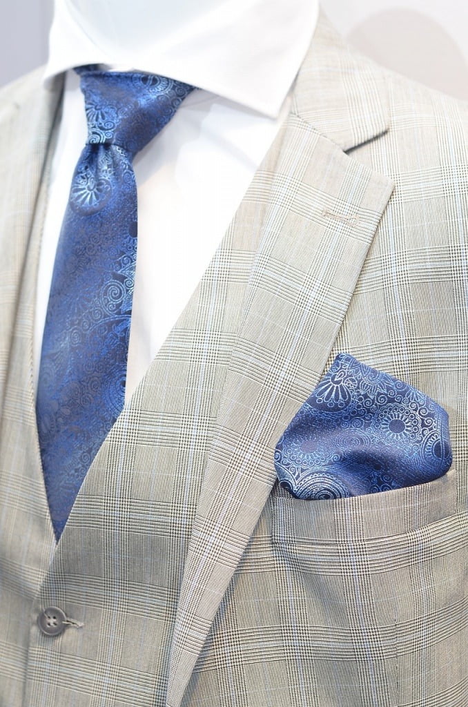
- The most important thing to remember with complimentary schemes is to keep it simple. If you’re wearing a blue/orange combo, keep the accenting colour to one or 2 pieces. Any more and it may be a bit overdone.
- The accenting colour should be usually be the warmer of the colours used. The gentleman in the example uses a simple orange shirt as the accent to the main colour in his outfit which is the blue.
Anything else?
God yes! There’s a lot to know not only about matching, but contrast, symbolism, psychology and how it all ties in together. However this guide should give you a basic understanding of how colours work together and how you can use that to your advantage.
Need more help? Drop us a line at [email protected] and a consultant will get in touch. Or find us on Facebook and Insta!

About The Author
Alexander regularly mistakes the decisions that he makes in his life and most of the people he knows would say that he’s prone to doing some really dumb s***. Especially after a few glasses of red.
What he never regrets is his outfit. Whether he’s going all out or keeping it mono, he’s usually got his look down. Even if he is secretly a hot mess.
We don’t think he’s going to pull it off.
WANT MORE CONTENT? SUBSCRIBE TO OUR NEWSLETTER TO BE NOTIFIED OF NEW CONTENT AND OFFERS

